Client
BetterFit Benefits
Scope
Brand Adjustments, Color Palette & Typeface update, Business Card design with Virtual Business Card, PowerPoint Presentation
Agency
Randall Holbrook Art & Design
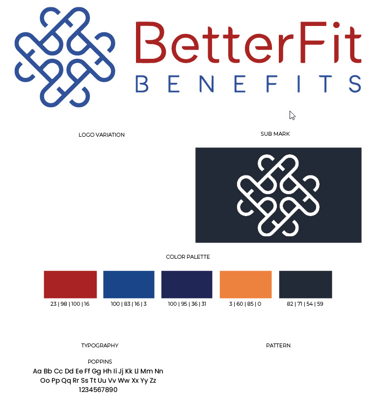
Aaron May has been refining his brand for the past two years, and asked if I could help him nail it down to a distinctive voice and image. Deepening and neutralizing the BetterFit Benefits color palette added a sound foundation and richer contrast than the blue and red they were sporting, and polishing up the presentation required removing "half-image" gradients that were very distracting, images that looked like typical HR classroom-style presentation meetings, and adding friendlier images showing collaboration and 1-1 meetings.

